Upon logging in to Retention Pro you will be greeted with your Dashboard which will reflect today's date or the last day with a closed repair order. You can access the Dashboard anytime by selecting the "Service" option located at the top of your Retention Pro screen. Additionally, you have the ability to adjust the date by clicking the calendar icon in the top right corner, allowing you to review data from previous days in both the Overview and Repair Order Details sections.
For more information on customizing the layout of the Dashboard please see - How Do You Change The Layout Of The Dashboard?


At the top right corner of your Dashboard you may see a panel that looks like this:

This data represents the total revenue generated by all of your campaigns over the last 90 days (a rolling 90 days) and an estimate of your return on investment for your Retention Pro subscription. It is calculated by taking the overall visits of customers who received campaigns within the last 90 days (if a customer received more than one campaign they are only counted once) and comparing it to your subscription and campaign costs.
Overview
The first section of the Dashboard in the Overview section, this will provide some general data regarding the repair orders that are currently reflecting on the dashboard.


Daily Customer Count
This shows both your closed repair orders for that day and the number of repair orders in the last 30 days. This is a rolling 30 days and not monthly.
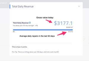
Total Daily Revenue
This is the gross value of the repair orders today. It also shows the net value below it. The number below the bar is the maximum net value in the last 30 days. This is a rolling 30 days and not monthly.
Average Repair Order
This is the total number of repair orders for today, compared to the maximum number of repair orders in the last 30 days. This is a rolling 30 days and not monthly.

You can click on the blue question mark icon next to any of these to see a brief explanation of the data presented.
Customer Visit Frequency and Monthly Repairs


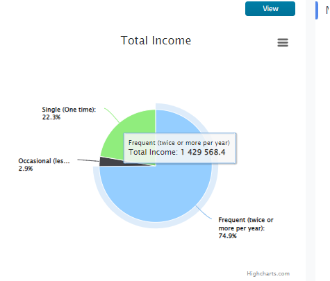
Customer Visit Frequency
Pie charts illustrating the frequency of customer visits to your shop, along with the income generated from one-time customers compared to those who visit occasionally or frequently.
Monthly Repairs
A chart of your total repair orders per month, average repair orders per month, total gross income per month, net income, and margin.
If you click on the View button at the top right of any of the report snapshots on the Dashboard it will take you to the full report available in the Analytics section.
For the Customer Visit Frequency report you will see 3 vertical lines next to Customer Count and Total Income. If you click on these lines it will open exporting options for that specific data set.
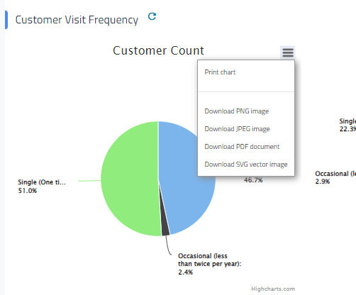

You can also “hover” above sections of the Customer Visit Frequency chart or the Monthly Repairs graph to see more details about the data represented by that visual.

Campaign and Customer Reports
These next sections contain quick “at a glance” snips of reports that are generally related to customers and campaigns. When customer names appear in the list, they will be highlighted in blue. You can click on any of these names to access the customer's profile directly.

Campaign Performance
A tool that helps show you how cost-effective your campaigns are on a broader scale
Year Over Year Averages
Averages for repair order counts and income for each month of the past year

Invalid Customers
A list of your customers that may have invalid data including emails, phones and addresses. This information can be updated in your Point of Sale and we will reflect that once it has been updated!
Deferred Work
A listing of recent deferred/recommended work including the customer, phone number, and date that it was recommended.
Text Message Sentiment
Shows the general sentiment of incoming text messages as responses to campaigns.
Repair Order Details


A listing of all closed repair orders from that day. From here you can click Show Details and open the Repair Order, click on the customer's name to go to the customer profile, or click on the vehicle to go to the vehicle profile. For more information please see - What Repair Orders Will Be On The Dashboard?
Return to the main article - Dashboard
📽️For a video tutorial on the dashboard see Retention Pro Dashboard