Widgets are the building blocks of your website, giving you the flexibility to add, arrange, and manage content with ease. They power key site functionality and significantly influence your overall design. By using a mix of widgets you can create a dynamic, interactive experience that keeps visitors engaged.
Widget Library
The widget library is where all the widgets can be found. They are broken down into categories with a search function at the top.
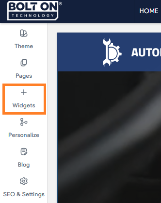
In the side panel, click Widgets.
Add Widgets
There are several ways to add widgets which can vary depending on whether you are using Classic Editor, flex mode, or Editor 2.0. The following is how you can add widgets:
Add Widgets from the Widget Library
To add widgets from the widget library:
- In the side panel, click Widgets.
- Use the search bar at the top or scroll through the library sections to find the widget you need.
- Click and drag the widget to the location you want in the site. A blue placement indicator appears.
- The widget appears in the location shown by the blue placement indicator.
When dragging-and-dropping a widget to your site, note the text in the blue placement indicator (Classic editor only):
-
Insert here. The widget will be added to an existing row or column.
-
Insert in new row. A new row will be added and the widget will be placed inside of it.
-
Insert in new column. A new column will be added and the widget will be placed inside of it.
Add Widgets from the Canvas
To add widgets from the canvas:
-
In Classic Editor only, right-click any widget and select Add widget below from the context menu to place a new widget directly beneath it.
-
In Flex mode or Editor 2.0, click the plus (+) icon in the floating menu.
-
If you are right-clicking on a column, click Add, and select Add widget below
-
-
Select from the four most popular widgets or click More widgets to open the full menu. After adding the widget, you can edit it as usual.
-
Click the plus + icon in the floating menu.
-
If you are right clicking a column, click Add and select Add widget below.
-
Edit Widget: Content and Design
You can customize widgets to control the content, appearance, and layout of your site, giving you more flexibility over which features are available and how they behave.
Most widgets will have an area for its content as well as its design.
Content Area
The content area is where a widget's content is typically configured. The available sections and options in the content area vary depending on the widget. For example, some widgets allow you to add a link, while others do not.
To open the content editor, right-click the widget and select Edit Content. If you are in Flex mode or Editor 2.0, click the element to open the floating menu, then choose the content editor option.
Edit Design
Most widgets in the editor have design options that enable you to customize the widget's appearance for your site. Not all widgets will have the same options. For example, some widgets do not allow you to edit inner spacing wile others do not let you change outer spacing.
To access the design editor, right-click the element and select Edit Design. If you are in flex mode or Editor 2.0, select Edit Design from the floating menu to open the design panel. Click the element to open the menu and then click the option to edit design.
The following are common design settings:
- Text Styles - For widgets with text, you can edit the text styles. Any changes you make for a specific widget will override the Theme Text style.
- Layout - Layout options are usually specific to certain widgets. To select from the set of layout options available for that widget, click the layout that appears in the Design Editor (or click the small arrow beside it) to open the Select Layout menu. To change the selected layout, click the layout you want to use instead and it will be updated in the widget.
- Style:
- Color - Click the round color icon to the right of the setting name to open the color picker and change the color.
- Border - Change the width of the border using the slider or text box. Click the gear icon (Gray gear shaped icon) for more options.
- Background - Use a background image or color for this widget using the Choose and Place Images dialog or a video URL.
- Width and Height - Use the slider or text box to change the number of pixels.
- Rounded Corners - Increase or decrease the rounding of the corners on a widget. Click the gear icon (Gray gear shaped icon) for more options.
- Shadows - Toggle on or off a shadow for this widget.
- Text - Set various aspects of the text, such as font family, font weight, etc.
- Buttons - Widgets with a button will offer the ability to select whether the button inherits the primary or secondary button style defined in the theme panel. In addition, you can choose between different button layouts, make edits to the button style, button text (font, text size), and adjust the inner/outer spacing.
Any changes you make in the design editor override the button styles set at the theme level. To restore the original theme button style, click Reset to theme style. - Spacing - Change the inner spacing (spacing inside the widget edges) and outer spacing (spacing outside the widget edges). Each number in the outer box sets the outer spacing for its own side (top, bottom, left, or right), and each number in the inner box sets the inner spacing for its own side (top, bottom, left, or right).
- Animation - Entrance animations let you animate widgets and page widgets when they are first loaded on your site. Motion and interactivity make your site more memorable and help draw attention to key sections, such as your phone number or contact button.
Additionally, you can control where the animation starts and ends by using the Scroll settings.- To add an animation:
- To access the content editor, right click the widget and select Edit Content.
- Click the element to open the floating menu, then click on content editor.
- Navigate to the Animation section.
- Select a Trigger and Animation.
- (Optional) Customize the animation. For example, the direction it enters from.
- To add an animation:
- Alignment - Set whether the widget is aligned to the left, right, or center of its area.
Some widgets can look or behave differently across views, so always check each view after adding a widget to confirm it appears correctly.
To set the alignment, right-click the widget, and click on the Align Left, Align Center, or Align Right icon. - Select Container - Selects the container the widget is in, allowing you to easily find and edit it.
- Copy and Paste - A widget can be copied and pasted to another location. The paste option only appears if a widget has been copied. Right-click the widget, and click Copy or Paste.
- Hide On Device - Use the hide on device feature to change your content depending on the device a visitor uses to access your website. For example, show a click-to-call widget for mobile users or a contact form for desktop users. Right click the widget, click Hide on Device, select a device. If an eye icon is present in the side panel, this indicates there are hidden elements on the device you are currently editing. To view the hidden elements click the eye icon.
- Edit Widget HTML/CSS - Allows you to make changes to the widget's HTML or CSS. We only recommend this option if you are comfortable with these languages. Right-click the widget, and then click Edit HTML/CSS.
- Set Widget As Anchor - Anchor links let you send visitors to a specific section of the page, making it easier for them to get from place to place on a longer page or to a specific section that you want to reference. Right-click the widget, and click Set As Anchor.
- Delete Widget - To delete a widget, removing it from all views and devices, right-click the widget, and click Delete.